SKU: CS-FC7DA33306C571DACollection: AmberPort Jihoxe Supply
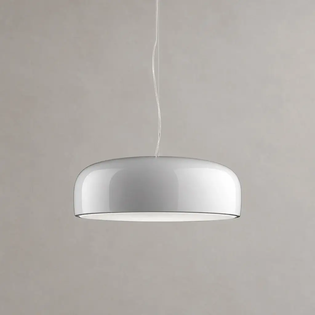
Smithfield Pendant Light
Category: Home
SKU: CS-FC7DA33306C571DA
Key Specifications
From product details- Sleek dome shape
- Modern, space-saving design with bright light.
- Five colors
- White, black, grey, green or red to suit any decor.
- Sloped-ceiling ready
- Fits ceilings under 30°, with a 59″ adjustable cable.
- Size
- Dia 45cm x H 15cm / ∅ 17.7″ x H 5.9″, Weight: 6kg / 13.2 lbs
- Material
- Aluminium and Polycarbonate.
- Light source
- LED bulb or Edison bulb.
- Voltage
- AC 110-240V
- Mounting
- Ceiling
Order Subtotal (1 item):
MYR 2,062.50
check_circle
25 available · Fulfillment subject to confirmation
Quantity:
Sold by
AmberPort Jihoxe Supply
Product Details & Specifications
Smithfield Pendant Light — /* ===== Smithfield Pendant Light — every rule scoped to .vk-smithfield-wrap ===== */ vk-smithfield-wrap, .vk-smithfield-wrap *, .vk-smithfield-wrap *::before, .vk-smithfield-wrap *::after { box-sizing: border-box; margin: 0; padding: 0; } vk-smithfield-wrap { position: relative; z-index: 0; isolation: isolat…
/* ===== Smithfield Pendant Light — every rule scoped to .vk-smithfield-wrap ===== */
.vk-smithfield-wrap, .vk-smithfield-wrap *, .vk-smithfield-wrap *::before, .vk-smithfield-wrap *::after { box-sizing: border-box; margin: 0; padding: 0; }
.vk-smithfield-wrap { position: relative; z-index: 0; isolation: isolate; width: 100%; max-width: 680px; margin: 0; padding: 0; color: #1d1b17; font-family: -apple-system, BlinkMacSystemFont, "Segoe UI", Roboto, "Helvetica Neue", Arial, "Noto Sans", sans-serif; -webkit-font-smoothing: antialiased; line-height: 1.6; }
.vk-smithfield-wrap img { max-width: 100%; height: auto; }
.vk-smithfield-wrap a { color: #876846; text-underline-offset: 3px; }
.vk-smithfield-wrap .vk-smithfield-divider { height: 1px; margin: 2rem 0; background: #fbf8f3; overflow: hidden; }
.vk-smithfield-wrap .vk-smithfield-intro { margin-bottom: 1rem; color: #3a3834; font-size: 15px; line-height: 1.75; }
.vk-smithfield-wrap .vk-smithfield-section-label { margin-bottom: .65rem; color: #876846; font-size: 11px; font-weight: 500; letter-spacing: .1em; text-transform: uppercase; scroll-margin-top: 90px; }
/* Video */
/* Features */
.vk-smithfield-wrap .vk-smithfield-features { display: grid; grid-template-columns: repeat(3, 1fr); gap: 10px; }
.vk-smithfield-wrap .vk-smithfield-feature, .vk-smithfield-wrap .vk-smithfield-option { min-width: 0; padding: .9rem; border: 1px solid #f5eee5; border-radius: 8px; background: #fff; }
.vk-smithfield-wrap .vk-smithfield-icon { display: flex; width: 28px; height: 28px; align-items: center; justify-content: center; margin-bottom: .6rem; border-radius: 6px; background: #e8dbc6; }
.vk-smithfield-wrap .vk-smithfield-feature h4, .vk-smithfield-wrap .vk-smithfield-option h5 { margin-bottom: .3rem; color: #1d1b17; font-size: 13px; font-weight: 500; line-height: 1.45; }
.vk-smithfield-wrap .vk-smithfield-feature p, .vk-smithfield-wrap .vk-smithfield-option p { color: #3f3d39; font-size: 12px; line-height: 1.6; overflow-wrap: anywhere; }
/* Color option */
/* Dimension card */
.vk-smithfield-wrap .vk-smithfield-dimension-card { padding: 1.2rem; border: 1px solid #f5eee5; border-radius: 10px; background: #fbf8f3; scroll-margin-top: 90px; }
.vk-smithfield-wrap .vk-smithfield-dimension-table { width: 100%; border-collapse: collapse; }
.vk-smithfield-wrap .vk-smithfield-dimension-table th { padding: 0 0 8px; border-bottom: 1px solid #e5dacb; color: #876846; font-size: 11px; font-weight: 500; letter-spacing: .06em; text-align: left; text-transform: uppercase; }
.vk-smithfield-wrap .vk-smithfield-dimension-table td { padding: 9px 0 0; color: #2a2826; font-size: 13px; line-height: 1.55; vertical-align: top; overflow-wrap: anywhere; }
.vk-smithfield-wrap .vk-smithfield-dimension-table td:first-child { width: 29%; padding-right: 12px; color: #876846; font-weight: 500; }
.vk-smithfield-wrap .vk-smithfield-dimfig { max-width: 300px; margin: 1rem auto 0; text-align: center; }
.vk-smithfield-wrap .vk-smithfield-dimfig a { display: block; padding: 5px; border: 1px solid #f5eee5; border-radius: 8px; background: #fff; }
.vk-smithfield-wrap .vk-smithfield-dimfig a:hover { border-color: #e1d4c1; }
.vk-smithfield-wrap .vk-smithfield-dimfig img { display: block; width: 100%; aspect-ratio: 1 / 1; object-fit: contain; background: #fff; border-radius: 4px; cursor: zoom-in; }
.vk-smithfield-wrap .vk-smithfield-dimension-note { margin-top: .75rem; color: #876846; font-size: 11px; line-height: 1.5; text-align: center; }
/* Pure-CSS :target lightbox */
.vk-smithfield-wrap .vk-smithfield-zoom { display: none; visibility: hidden; pointer-events: none; position: fixed; inset: 0; z-index: 99999; align-items: center; justify-content: center; padding: 24px; background: rgba(20,19,16,.92); }
.vk-smithfield-wrap .vk-smithfield-zoom:target { display: flex; visibility: visible; pointer-events: auto; }
.vk-smithfield-wrap .vk-smithfield-zoom-backdrop { position: absolute; inset: 0; display: block; cursor: zoom-out; }
.vk-smithfield-wrap .vk-smithfield-zoom-inner { position: relative; z-index: 1; max-width: 100%; text-align: center; pointer-events: none; }
.vk-smithfield-wrap .vk-smithfield-zoom-img { width: 100%; max-width: 1200px; height: auto; max-height: 86vh; object-fit: contain; border-radius: 4px; background: #fff; }
.vk-smithfield-wrap .vk-smithfield-zoom-cap { margin-top: 10px; color: #f5eee5; font-size: 12px; letter-spacing: .04em; }
.vk-smithfield-wrap .vk-smithfield-zoom-close { position: absolute; top: 12px; right: 16px; z-index: 2; display: flex; width: 44px; height: 44px; align-items: center; justify-content: center; color: #f5eee5; font-size: 28px; line-height: 1; text-decoration: none; }
/* Spec table */
.vk-smithfield-wrap .vk-smithfield-spec-table { width: 100%; border-collapse: collapse; }
.vk-smithfield-wrap .vk-smithfield-spec-table tr { border-bottom: 1px solid #fbf8f3; }
.vk-smithfield-wrap .vk-smithfield-spec-table tr:nth-child(odd) { background: #fdfbf8; }
.vk-smithfield-wrap .vk-smithfield-spec-table tr:last-child { border-bottom: 0; }
.vk-smithfield-wrap .vk-smithfield-spec-table td { padding: 10px 8px; font-size: 14px; line-height: 1.55; vertical-align: top; overflow-wrap: anywhere; }
.vk-smithfield-wrap .vk-smithfield-spec-table td:first-child { width: 42%; padding-right: 1rem; color: #625f59; }
/* Care */
/* Downloads */
.vk-smithfield-wrap .vk-smithfield-dl { display: grid; grid-template-columns: repeat(3, 1fr); gap: 10px; }
.vk-smithfield-wrap .vk-smithfield-dl-card { display: flex; min-height: 44px; align-items: center; gap: 10px; padding: .85rem .9rem; border: 1px solid #f5eee5; border-radius: 8px; background: #fff; color: #1d1b17; text-decoration: none; }
.vk-smithfield-wrap .vk-smithfield-dl-card:hover { border-color: #e1d4c1; background: #fdfbf8; }
.vk-smithfield-wrap .vk-smithfield-dl-card .vk-smithfield-icon { flex-shrink: 0; margin: 0; }
.vk-smithfield-wrap .vk-smithfield-dl-card b { display: block; font-size: 13px; font-weight: 500; line-height: 1.35; }
.vk-smithfield-wrap .vk-smithfield-dl-card small { display: block; color: #625f59; font-size: 11px; line-height: 1.4; }
/* FAQ */
.vk-smithfield-wrap .vk-smithfield-faq-item { border-bottom: 1px solid #fbf8f3; }
.vk-smithfield-wrap .vk-smithfield-faq-item:last-child { border-bottom: 0; }
.vk-smithfield-wrap .vk-smithfield-faq-item > summary { position: relative; display: flex; min-height: 44px; cursor: pointer; align-items: center; padding: 14px 32px 14px 0; color: #1d1b17; font-size: 15px; font-weight: 500; line-height: 1.5; list-style: none; }
.vk-smithfield-wrap .vk-smithfield-faq-item > summary::marker { content: ""; }
.vk-smithfield-wrap .vk-smithfield-faq-item > summary::-webkit-details-marker { display: none; }
.vk-smithfield-wrap .vk-smithfield-faq-item > summary::after { position: absolute; top: 50%; right: 4px; width: 10px; height: 10px; border-right: 1.5px solid #876846; border-bottom: 1.5px solid #876846; content: ""; transform: translateY(-70%) rotate(45deg); transition: transform .2s ease; }
.vk-smithfield-wrap .vk-smithfield-faq-item[open] > summary::after { transform: translateY(-30%) rotate(-135deg); }
.vk-smithfield-wrap .vk-smithfield-faq-a { margin: 0 0 14px; padding-right: 32px; color: #3f3d39; font-size: 13px; line-height: 1.7; }
@media (max-width: 520px) {
.vk-smithfield-wrap .vk-smithfield-features { gap: 6px; }
.vk-smithfield-wrap .vk-smithfield-feature { padding: .6rem; }
.vk-smithfield-wrap .vk-smithfield-feature h4 { font-size: 11.5px; }
.vk-smithfield-wrap .vk-smithfield-feature p { font-size: 10.5px; }
.vk-smithfield-wrap .vk-smithfield-option, .vk-smithfield-wrap .vk-smithfield-dl { grid-template-columns: 1fr; }
.vk-smithfield-wrap .vk-smithfield-dimension-card { padding: .85rem; }
.vk-smithfield-wrap .vk-smithfield-spec-table td { font-size: 13px; } /* end */
}
.vk-smithfield-wrap .vk-smithfield-intro-note { margin: 1.25rem 0 0; padding: .9rem 1rem; border: 1px solid #e5dacb; border-left: 3px solid #876846; border-radius: 8px; background: #fbf8f3; color: #2a2826; font-size: 14px; line-height: 1.7; }
.vk-smithfield-wrap .vk-smithfield-intro-note p { margin: 0; }
.vk-smithfield-wrap .vk-smithfield-intro-note p + p { margin-top: .5rem; }
.vk-smithfield-wrap .vk-smithfield-note-lead { color: #b23a1e; font-weight: 600; }
.vk-smithfield-wrap .vk-smithfield-dimension-table td:nth-child(2) { padding-right: 12px; }
.vk-smithfield-wrap .vk-smithfield-dimfigs { display: flex; flex-wrap: wrap; justify-content: center; gap: 10px; margin-top: 1rem; }
.vk-smithfield-wrap .vk-smithfield-dimfigs .vk-smithfield-dimfig { flex: 0 1 300px; min-width: 0; max-width: none; margin: 0; }
.vk-smithfield-wrap .vk-smithfield-dimfig b { display: block; margin-top: 5px; color: #2a2826; font-size: 11.5px; font-weight: 600; line-height: 1.4; }
@media (max-width: 560px) {
.vk-smithfield-wrap .vk-smithfield-dimfigs .vk-smithfield-dimfig { flex: 0 1 calc(50% - 5px); }
.vk-smithfield-wrap .vk-smithfield-dimension-table td { font-size: 12px; } /* end */
}
@media (max-width: 520px) {
.vk-smithfield-wrap .vk-smithfield-videos { grid-template-columns: 1fr; } /* end */
}
.vk-smithfield-wrap .vk-smithfield-intro-note { border-color: #e5dacb; border-left-color: #876846; background: #fbf8f3; color: #2a2826; }
.vk-smithfield-wrap .vk-smithfield-intro-note p { margin: 0; }
.vk-smithfield-wrap .vk-smithfield-intro-note p + p { margin-top: .4rem; }
@media (max-width: 520px) {
.vk-smithfield-wrap .vk-smithfield-sz-grid { grid-template-columns: 1fr 1fr; gap: 8px; } /* end */
}
/* Legibility: larger type */
.vk-smithfield-wrap .vk-smithfield-intro { font-size: 16px; line-height: 1.8; }
.vk-smithfield-wrap .vk-smithfield-section-label { font-size: 12.5px; font-weight: 600; letter-spacing: .08em; }
.vk-smithfield-wrap .vk-smithfield-feature h4 { font-size: 15px; font-weight: 600; }
.vk-smithfield-wrap .vk-smithfield-feature p { font-size: 14px; line-height: 1.65; }
.vk-smithfield-wrap .vk-smithfield-dimension-note { font-size: 13px; }
.vk-smithfield-wrap .vk-smithfield-spec-table td { font-size: 15px; }
.vk-smithfield-wrap .vk-smithfield-dl-card b { font-size: 15px; font-weight: 600; }
.vk-smithfield-wrap .vk-smithfield-faq-item > summary { font-size: 16px; font-weight: 600; }
.vk-smithfield-wrap .vk-smithfield-faq-a { font-size: 15px; line-height: 1.75; }
.vk-smithfield-wrap .vk-smithfield-zoom-cap { font-size: 14px; }
@media (max-width: 520px) {
.vk-smithfield-wrap .vk-smithfield-feature h4 { font-size: 14px; }
.vk-smithfield-wrap .vk-smithfield-feature p { font-size: 13px; }
.vk-smithfield-wrap .vk-smithfield-spec-table td { font-size: 14px; } /* end */
}
.vk-smithfield-wrap .vk-smithfield-dimension-table td:first-child { width: 30%; }
/* Extra legibility: bigger type, darker text, stronger labels */
.vk-smithfield-wrap { color: #161616; }
.vk-smithfield-wrap .vk-smithfield-intro { font-size: 17px; line-height: 1.8; color: #222; }
.vk-smithfield-wrap .vk-smithfield-section-label { font-size: 13.5px; font-weight: 700; letter-spacing: .07em; color: #876846; }
.vk-smithfield-wrap .vk-smithfield-feature h4 { font-size: 16.5px; font-weight: 700; color: #161616; }
.vk-smithfield-wrap .vk-smithfield-feature p { font-size: 15px; line-height: 1.65; color: #2b2b2b; }
.vk-smithfield-wrap .vk-smithfield-dimension-table th { font-size: 13px; font-weight: 700; color: #876846; }
.vk-smithfield-wrap .vk-smithfield-dimension-table td { font-size: 16px; color: #1f1f1f; }
.vk-smithfield-wrap .vk-smithfield-dimension-table td:first-child { color: #876846; font-weight: 600; }
.vk-smithfield-wrap .vk-smithfield-dimension-note { font-size: 14px; color: #876846; }
.vk-smithfield-wrap .vk-smithfield-spec-table td { font-size: 16px; line-height: 1.6; color: #1f1f1f; }
.vk-smithfield-wrap .vk-smithfield-spec-table td:first-child { color: #4a4844; font-weight: 600; }
.vk-smithfield-wrap .vk-smithfield-dl-card b { font-size: 16px; font-weight: 700; color: #161616; }
.vk-smithfield-wrap .vk-smithfield-faq-item > summary { font-size: 17px; font-weight: 700; color: #161616; }
.vk-smithfield-wrap .vk-smithfield-faq-a { font-size: 16px; line-height: 1.75; color: #2b2b2b; }
.vk-smithfield-wrap .vk-smithfield-zoom-cap { font-size: 15px; }
@media (max-width: 520px) {
.vk-smithfield-wrap .vk-smithfield-intro { font-size: 16px; }
.vk-smithfield-wrap .vk-smithfield-feature h4 { font-size: 15px; }
.vk-smithfield-wrap .vk-smithfield-feature p { font-size: 14px; }
.vk-smithfield-wrap .vk-smithfield-spec-table td, .vk-smithfield-wrap .vk-smithfield-dimension-table td { font-size: 15px; }
.vk-smithfield-wrap .vk-smithfield-faq-item > summary { font-size: 16px; }
.vk-smithfield-wrap .vk-smithfield-faq-a { font-size: 15px; } /* end */
}
/* Theme-proof legibility: override the store theme's thin, letter-spaced, uppercase heading styles */
.vk-smithfield-wrap, .vk-smithfield-wrap p, .vk-smithfield-wrap h3, .vk-smithfield-wrap h4, .vk-smithfield-wrap h5, .vk-smithfield-wrap td, .vk-smithfield-wrap th, .vk-smithfield-wrap li, .vk-smithfield-wrap summary, .vk-smithfield-wrap b, .vk-smithfield-wrap strong, .vk-smithfield-wrap span, .vk-smithfield-wrap div, .vk-smithfield-wrap a { font-family: -apple-system, BlinkMacSystemFont, "Segoe UI", Roboto, "Helvetica Neue", Arial, "Noto Sans", sans-serif !important; letter-spacing: normal !important; -webkit-font-smoothing: antialiased; }
.vk-smithfield-wrap p, .vk-smithfield-wrap td, .vk-smithfield-wrap li { font-weight: 400 !important; }
.vk-smithfield-wrap .vk-smithfield-intro { font-size: 17px !important; line-height: 1.75 !important; color: #1f1f1f !important; }
.vk-smithfield-wrap .vk-smithfield-section-label { font-size: 14px !important; font-weight: 700 !important; letter-spacing: .06em !important; text-transform: uppercase !important; color: #876846 !important; }
.vk-smithfield-wrap .vk-smithfield-feature h4 { margin: 0 0 6px !important; font-size: 16.5px !important; font-weight: 700 !important; line-height: 1.35 !important; text-transform: none !important; letter-spacing: normal !important; color: #161616 !important; }
.vk-smithfield-wrap .vk-smithfield-feature p { font-size: 15px !important; line-height: 1.6 !important; color: #2a2a2a !important; }
.vk-smithfield-wrap .vk-smithfield-dimension-table th { font-size: 13.5px !important; font-weight: 700 !important; color: #876846 !important; text-transform: uppercase !important; letter-spacing: .04em !important; }
.vk-smithfield-wrap .vk-smithfield-dimension-table td { font-size: 16px !important; color: #1a1a1a !important; }
.vk-smithfield-wrap .vk-smithfield-dimension-table td:first-child { font-weight: 700 !important; color: #876846 !important; }
.vk-smithfield-wrap .vk-smithfield-dimension-note { font-size: 14px !important; color: #876846 !important; }
.vk-smithfield-wrap .vk-smithfield-spec-table td { font-size: 16px !important; line-height: 1.55 !important; color: #1a1a1a !important; }
.vk-smithfield-wrap .vk-smithfield-spec-table td:first-child { font-weight: 700 !important; color: #3a3834 !important; }
.vk-smithfield-wrap .vk-smithfield-spec-table a { color: #876846 !important; font-weight: 600 !important; }
.vk-smithfield-wrap .vk-smithfield-dl-card b { font-size: 16px !important; font-weight: 700 !important; color: #161616 !important; }
.vk-smithfield-wrap .vk-smithfield-faq-item > summary { font-size: 17px !important; font-weight: 700 !important; color: #161616 !important; text-transform: none !important; }
.vk-smithfield-wrap .vk-smithfield-faq-a { font-size: 16px !important; line-height: 1.7 !important; color: #2a2a2a !important; }
@media (max-width: 520px) {
.vk-smithfield-wrap .vk-smithfield-intro { font-size: 16px !important; }
.vk-smithfield-wrap .vk-smithfield-feature h4 { font-size: 15px !important; }
.vk-smithfield-wrap .vk-smithfield-feature p { font-size: 14px !important; }
.vk-smithfield-wrap .vk-smithfield-spec-table td, .vk-smithfield-wrap .vk-smithfield-dimension-table td { font-size: 15px !important; }
.vk-smithfield-wrap .vk-smithfield-faq-a { font-size: 15px !important; } /* end */
}
.vk-smithfield-wrap .vk-smithfield-dimension-table td:first-child { width: 30%; }
/* Grid lines on the size table */
.vk-smithfield-wrap .vk-smithfield-dimension-table { border-collapse: collapse !important; border: 1px solid #e1d4c1 !important; background: #fff; }
.vk-smithfield-wrap .vk-smithfield-dimension-table th, .vk-smithfield-wrap .vk-smithfield-dimension-table td { border: 1px solid #e1d4c1 !important; padding: 10px 12px !important; vertical-align: middle !important; }
.vk-smithfield-wrap .vk-smithfield-dimension-table th { background: #e8dbc6 !important; }
.vk-smithfield-wrap .vk-smithfield-dimension-table tbody tr:nth-child(even) td { background: #fbf8f3; }
/* Zebra rows on the Details table: set on the cells with !important so the theme can't wipe it */
.vk-smithfield-wrap .vk-smithfield-spec-table tr:nth-child(odd) td { background: #fbf8f3 !important; }
.vk-smithfield-wrap .vk-smithfield-spec-table tr:nth-child(even) td { background: #ffffff !important; }
/* Walnut accents: echo the wooden frame */
.vk-smithfield-wrap .vk-smithfield-divider { background: linear-gradient(90deg, #e5dacb, #876846 50%, #e5dacb) !important; }
.vk-smithfield-wrap .vk-smithfield-spec-table td:first-child { color: #876846 !important; }
.vk-smithfield-wrap .vk-smithfield-dimension-table td:first-child { color: #876846 !important; }
.vk-smithfield-wrap .vk-smithfield-feature { border-top: 3px solid #876846 !important; }
/* Hide the old auto-generated "Sizing & questions" block (section.vk-geo2) so only the new FAQ shows */
section.vk-geo2[data-geo="v2"] { display: none !important; }
/* FAQ styled like the "Sizing & questions" block: serif title, italic accent word, plus icons */
.vk-smithfield-wrap .vk-smithfield-faq-title { margin: 0 0 6px !important; font-family: Georgia, "Times New Roman", serif !important; font-size: 26px !important; font-weight: 600 !important; line-height: 1.25 !important; color: #1d1d1d !important; letter-spacing: normal !important; text-transform: none !important; }
.vk-smithfield-wrap .vk-smithfield-faq-title em { font-family: Georgia, "Times New Roman", serif !important; font-style: italic !important; color: #876846 !important; }
.vk-smithfield-wrap .vk-smithfield-faq-sub { margin: 0 0 18px !important; font-size: 15px !important; line-height: 1.8 !important; color: #5a5a5a !important; }
.vk-smithfield-wrap .vk-smithfield-faq { border-top: 1px solid #e5dacb; }
.vk-smithfield-wrap .vk-smithfield-faq-item { border-bottom: 1px solid #e5dacb !important; }
.vk-smithfield-wrap .vk-smithfield-faq-item > summary { padding: 16px 32px 16px 2px !important; font-size: 15.5px !important; font-weight: 600 !important; color: #2b2b2b !important; }
.vk-smithfield-wrap .vk-smithfield-faq-item > summary::after { content: "+" !important; position: absolute; top: 50% !important; right: 6px !important; width: auto !important; height: auto !important; border: 0 !important; transform: translateY(-50%) !important; font-family: Georgia, serif !important; font-size: 20px !important; font-weight: 400 !important; line-height: 1 !important; color: #876846 !important; transition: transform .2s ease; }
.vk-smithfield-wrap .vk-smithfield-faq-item[open] > summary::after { content: "\2212" !important; transform: translateY(-50%) !important; }
.vk-smithfield-wrap .vk-smithfield-faq-a { margin: 0 0 16px !important; padding: 0 24px 0 2px !important; font-size: 15px !important; line-height: 1.8 !important; color: #555 !important; }
.vk-smithfield-wrap .vk-smithfield-swatches { display: flex; flex-wrap: wrap; gap: 10px 16px; margin: 1rem 0 0; padding: .9rem 1rem; border: 1px solid #e5dacb; border-radius: 8px; background: #fff; }
.vk-smithfield-wrap .vk-smithfield-swatch { display: flex; align-items: center; gap: 7px; font-size: 14.5px !important; font-weight: 600 !important; color: #1f1f1f !important; }
.vk-smithfield-wrap .vk-smithfield-swatch i { display: inline-block; width: 18px; height: 18px; border-radius: 50%; border: 1px solid rgba(0,0,0,.18); }
.vk-smithfield-wrap .vk-smithfield-swatches { align-items: center; }
.vk-smithfield-wrap .vk-smithfield-swatch-label { font-size: 14.5px !important; font-weight: 700 !important; color: #876846 !important; margin-right: 4px; }
.vk-smithfield-wrap .vk-smithfield-swatch b { font-weight: 700 !important; }
.vk-smithfield-wrap .vk-smithfield-dimension-table td:first-child { width: 24% !important; }
.vk-smithfield-wrap .vk-smithfield-dimfigs { display: flex; justify-content: center; gap: 12px; margin-top: 1rem; }
.vk-smithfield-wrap .vk-smithfield-dimfigs .vk-smithfield-dimfig { flex: 1 1 0; max-width: 240px; min-width: 0; margin: 0; }
.vk-smithfield-wrap .vk-smithfield-dimfigs .vk-smithfield-dimfig img { aspect-ratio: 1 / 1; object-fit: contain; }
.vk-smithfield-wrap .vk-smithfield-dl { grid-template-columns: repeat(3, 1fr); }
@media (max-width: 520px) {
.vk-smithfield-wrap .vk-smithfield-dl { grid-template-columns: 1fr; } /* end */
}
.vk-smithfield-wrap .vk-smithfield-dimension-table td small { display: block; margin-top: 2px; font-size: 13.5px !important; color: #4a4844 !important; }
/* Helix template accents */
.vk-smithfield-wrap .vk-smithfield-feature h4, .vk-smithfield-wrap .vk-smithfield-faq-item > summary { color: #261d16 !important; }
.vk-smithfield-wrap a { color: #6b4f30; }
.vk-smithfield-wrap .vk-smithfield-faq-title em, .vk-smithfield-wrap .vk-smithfield-faq-item > summary::after { color: #876846 !important; }
/* Size area matches the white diagram background */
.vk-smithfield-wrap .vk-smithfield-dimension-card { background: #ffffff !important; }
.vk-smithfield-wrap .vk-smithfield-dimfig a { border: 0 !important; padding: 0 !important; background: #ffffff !important; }
.vk-smithfield-wrap .vk-smithfield-dimfig img { background: #ffffff !important; }
.vk-smithfield-wrap .vk-smithfield-dimension-table td:first-child { width: 30% !important; }
.vk-smithfield-wrap .vk-smithfield-contact { margin: 0 0 1rem; padding: .9rem 1.1rem; border: 1px solid #e1d4c1; border-left: 3px solid #876846; border-radius: 8px; background: #fbf8f3; }
.vk-smithfield-wrap .vk-smithfield-contact p { margin: 0 !important; font-size: 15.5px !important; line-height: 1.7 !important; color: #1f1f1f !important; }
/* Customized service: copy on top, colour chart underneath */
.vk-smithfield-wrap .vk-smithfield-swatches { display: flex; flex-wrap: wrap; align-items: center; gap: 10px 16px; margin: 1rem 0 0; padding: .9rem 1rem; border: 1px solid #e1d4c1; border-radius: 8px; background: #fff; }
.vk-smithfield-wrap .vk-smithfield-swatch-label { font-size: 14.5px !important; font-weight: 700 !important; color: #5a4630 !important; }
.vk-smithfield-wrap .vk-smithfield-swatch { display: flex; align-items: center; gap: 7px; font-size: 14.5px !important; font-weight: 700 !important; }
.vk-smithfield-wrap .vk-smithfield-swatch i { display: inline-block; width: 18px; height: 18px; border-radius: 50%; border: 1px solid rgba(0,0,0,.18); }
/* Customized service: copy on the left, small colour chart on the right (click to enlarge) */
@media (max-width: 520px) {
.vk-smithfield-wrap .vk-smithfield-option-fig { max-width: 120px !important; width: 120px !important; } /* end */
}
/* Two notes side by side, each with a click-to-enlarge image */
@media (max-width: 520px) {
.vk-smithfield-wrap .vk-smithfield-notes2 { grid-template-columns: 1fr; } /* end */
}
.vk-smithfield-wrap .vk-smithfield-dimension-table td:first-child { width: 28% !important; }
@media (max-width: 520px) {
.vk-smithfield-wrap .vk-smithfield-figgrid { grid-template-columns: repeat(3, 1fr); } /* end */
}
.vk-smithfield-wrap .vk-smithfield-swatches { display: flex; flex-wrap: wrap; align-items: center; gap: 10px 16px; margin: 1rem 0 0; padding: .9rem 1rem; border: 1px solid #e1d4c1; border-radius: 8px; background: #fff; }
.vk-smithfield-wrap .vk-smithfield-swatch-label { font-size: 14.5px !important; font-weight: 700 !important; color: #5a4630 !important; }
.vk-smithfield-wrap .vk-smithfield-swatch { display: flex; align-items: center; gap: 7px; font-size: 14.5px !important; font-weight: 700 !important; }
.vk-smithfield-wrap .vk-smithfield-swatch i { display: inline-block; width: 18px; height: 18px; border-radius: 50%; border: 1px solid rgba(0,0,0,.18); }
.vk-smithfield-wrap .vk-smithfield-note-lead { color: #d62a00 !important; font-weight: 700 !important; }
.vk-smithfield-wrap .vk-smithfield-dimension-table td:first-child { width: 24% !important; }
.vk-smithfield-wrap .vk-smithfield-dimension-table td:first-child { width: 22% !important; }
.vk-smithfield-wrap .vk-smithfield-dimension-table th:nth-child(3), .vk-smithfield-wrap .vk-smithfield-dimension-table td:nth-child(3) { width: 18%; white-space: nowrap; }
.vk-smithfield-wrap .vk-smithfield-dimfigs .vk-smithfield-dimfig { max-width: 160px !important; }
Enhance the style of any room in your home with the Smithfield Pendant Light. Its sleek and modern design provides bright and space-saving illumination, while the variety of color options make it suitable for any decor. Choose from warm white lighting for the perfect ambience. Expertly crafted, it's the perfect addition to your home.
Please Note: Due to the influence of the shooting environment and lighting, there will be color differences between the actual object and the picture after post-processing. Please refer to the actual object.
Features
- Sleek dome shape
- Modern, space-saving design with bright light.
- Five colors
- White, black, grey, green or red to suit any decor.
- Sloped-ceiling ready
- Fits ceilings under 30°, with a 59″ adjustable cable.
- Product Size
- Size
- Size
- Dia 60cm x H 21cm / ∅ 23.6″ x H 8.3″, Weight: 8.6kg / 19 lbs
- 🔍 Click the diagram to enlarge
- Details
- Material
- Aluminium and Polycarbonate.
- Light source
- LED bulb or Edison bulb.
- Light source base type
- E26 or E27.
Finishes: White Black Grey Green Red
Dia 45cm x H 15cm / ∅ 17.7″ x H 5.9″, Weight: 6kg / 13.2 lbs
Power
- Voltage
- AC 110-240V
- Mounting
- Ceiling
- Body Finishes
- White, Black, Grey, Green, Red.
- Shade Finishes
- White, Black, Grey, Green, Red.
- Wiring
- Hardwired.
- Installation
- Sloped ceiling compatible (Sloped Ceiling Adaptable
Max 40W.
This Product
MYR 2,062.50
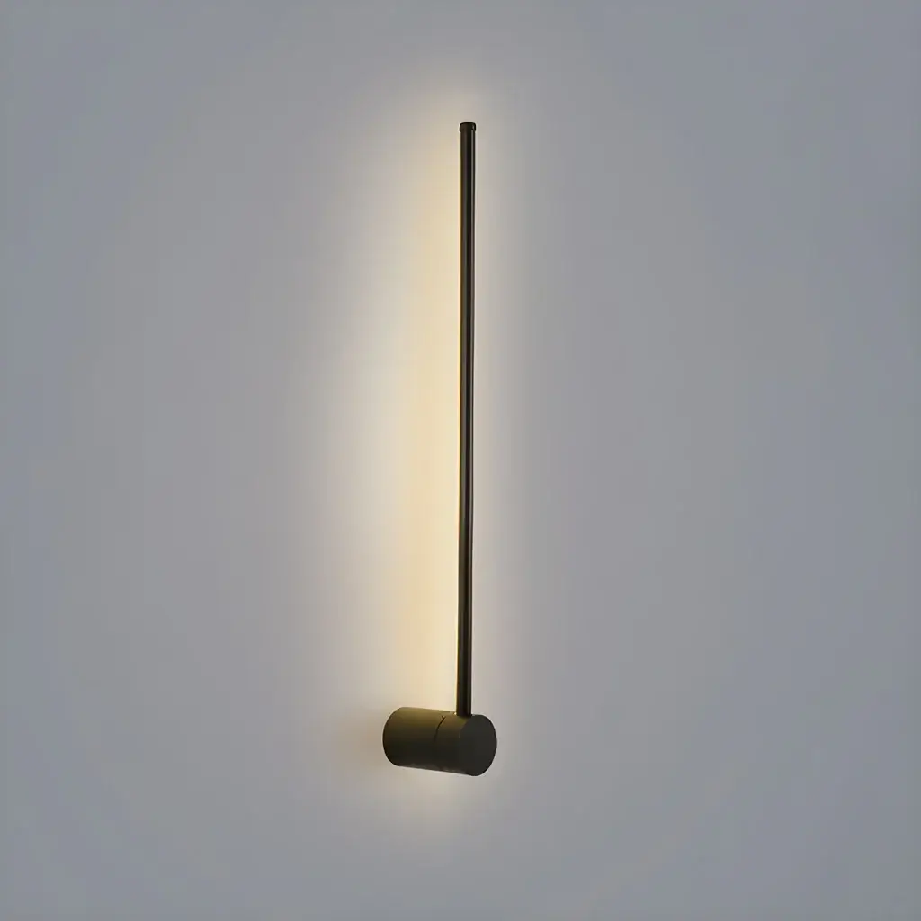
Linear LED Wall Light
MYR 641.25
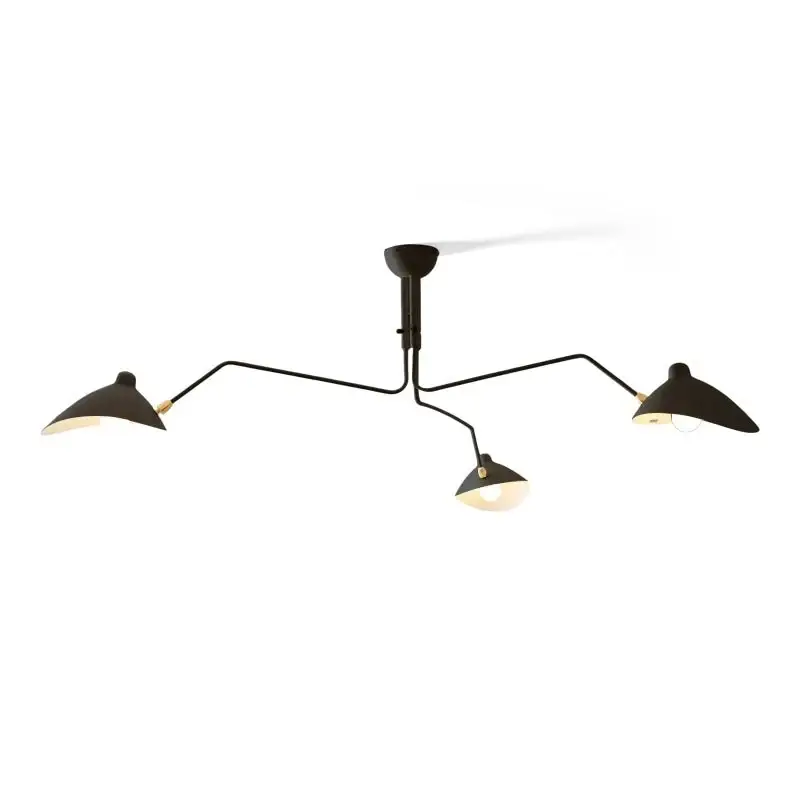
Multi-Arm Spider Ceiling Light A
MYR 2,558.75
Combined listing price:
MYR 5,262.50
Suggested from eligible marketplace listings; co-purchases and discounts are not verified.
Buyer Reviews (0)
Reviews for this product only.
No buyer reviews are available for this product yet.